Cooks Chemist
Worthing, Sussex- Premises
- Size: 85 square metres
Timescale: 8 weeks
- Scope of works
- Full refit
Design and drawings
Ceiling
Flooring
Bespoke pharmacy furniture
Joinery
Damp removal
Electrical
Shelving
Dispensary design
Most clients approach us with an idea of their pharmacy design requirements, but none has been more clearer than the brief on this project. From the outset the brief was clear, our client wanted a Victorian themed chemist shop to be brought into the 21st century.
We have always been incredibly proud of our long standing work in evolving pharmacy design over the last 25 years, so when we were approached by a client to create a modern Victorian themed chemist we were more than happy to oblige.
Based in the seaside town of Worthing, in Sussex the brief for this project was to create something different, unique and traditional with modern touches to be hidden from the naked eye. So our designers got to work and the end result - Cooks Chemist.
The key here was to offer a chemist shop feel in a contemporary setting, taking into account the extensive services pharmacy now offers. The Victorian style pharmacy furniture had to be designed for modern merchandising and understand the changing nature of dispensing medication and over the counter medication packaging.
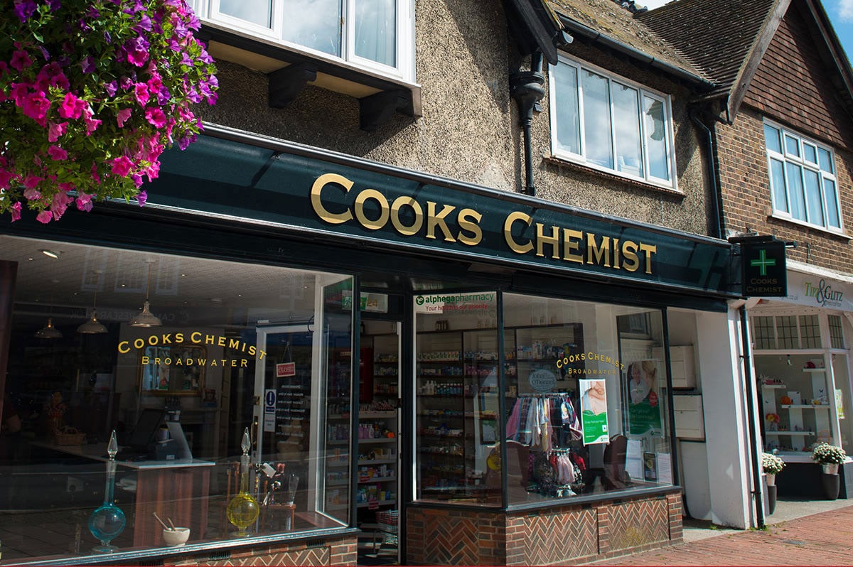
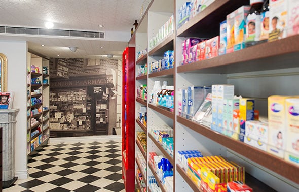
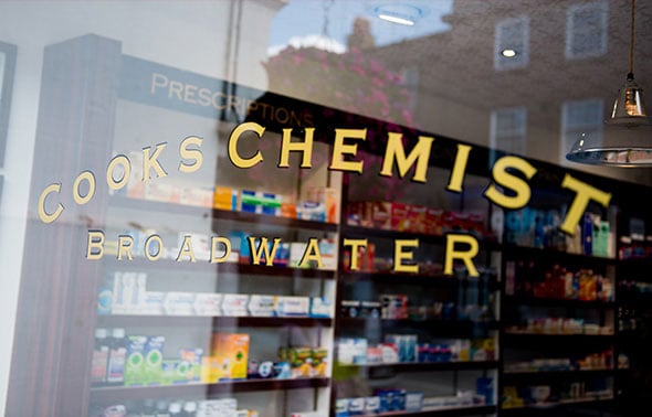
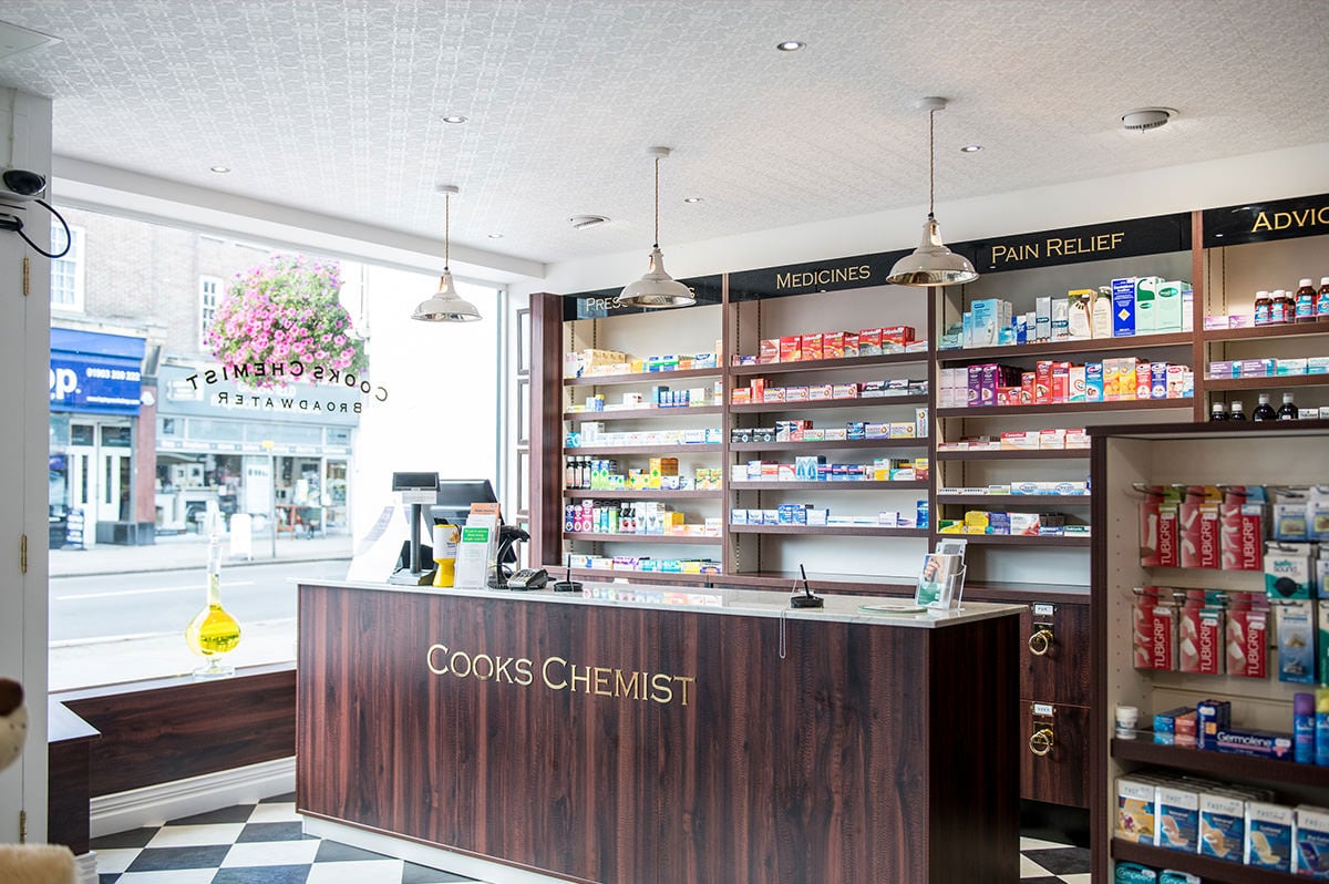
The design incorporates internal and external traditional signage, black and white checkerboard style flooring, mahogany furniture, white marble work tops and brass fittings. The brief called for a real working fire place and so to add to the theme and to make the chemist inviting and more suited to the patient user, a Chesterfield sofa created a comfortable and calm waiting area.
Our client had a vision and we worked to realise this in a cost effective design and functional approach. The design created demonstrates our design thinking and pharmacy design knowledge. The air conditioning units had to be hidden in order to create an authentic Victorian theme.
During the project, flooring removal revealed extensive damp which resulted in some minor building work to be carried out. The floor issue was resolved by communicating with the client on a daily basis and being open and transparent about any cost implications linked to the additional works.
Choosing Rapeed Design to carry out the Cooks Chemist project meant the client was able to work on the design by offering constant input, access expert pharmacy design knowledge and have one company see the project through from the concept to completion.
In-keeping with the chemist theme, some old medicine storage bottles were also introduced as part of the design. The shopfront has also been kept traditional and Victorian theme to achieve a seamless look both inside and out.


The response from the local customers has been positive. Speaking of the finished pharmacy refit, the Pharmacy Manager says, 'We love our shop, it's amazing. It's fresh, it's bright, it's completely different to what we are used to. We have more shelf space and we have more product selection for our customers.'


