Swalecliffe Pharmacy
5 St Johns Rd, Whitstable, CT5 2QT
- Premises
- Size: 316 sq mts
Timescale: 12 weeks
- Scope of works
- Full refit
Conceptual designs
Detailed drawings
3d visuals
Bespoke Joinery
Logo & branding
Shopfront
Main sign fascia
Projects management
Merchandising
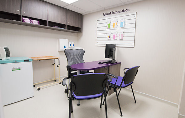
Consultation rooms
Heating & Ventilation
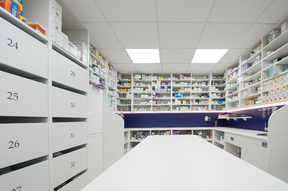
Dispensary
Flooring
Ceiling
Stock room
Wall covering
Client Background
With more than 20 years working in UK pharmacy dispensing, husband and wife team Ashwin and Meeta Sharda knew they wanted to set their stall and pharmacy extension and full refit was in order. After reviewing the options they appointed Rapeed Design to work with them to prepare a full pharmacy design and carry through the fit out. Taking up a large space is no easy feat, the space had to be well planned and the design, fixtures and fittings had to be fit for purpose and fully future-proof.
Points of note
As a family run pharmacy business the Sharda’s had an idea of what they wanted to achieve in their final pharmacy design. However, ‘the initial concept was different to what we have ended up with’, says Mr. Ashwin Sharda, pharmacist and owner of Swalecliffe Pharmacy in Whitstable in Kent.
In his advise to any pharmacist looking to get a pharmacy refit those who are willing to listen can be given positive and constructive advise on the best pharmacy design and refit solutions.
‘Through gentle persuasion we were guided in the right direction,’ he adds, speaking of the final result.
Mrs Sharda insists that she would recommend Rapeed Design to every pharmacist and believes that the pharmacy refit has not only given the area a new lease of life but there is also a feeling of pride that emanates.
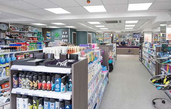
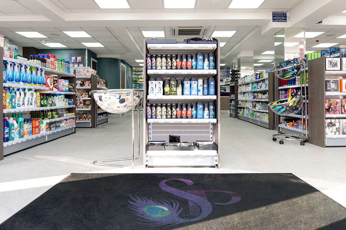
‘The care in implementing the design and the pride in everything that Rapeed Design have done for us here has been phenomenal,’ adds Mr Sharda. The pharmacy fit out included a full refit package including the pharmacy flooring, ceiling and lighting along with all of the furniture and key showcase units. In her description of the new pharmacy space in the pharmacy video Mrs Sharda compliments the furniture. Clean and visible retail lines have been added allowing for more browsing opportunities to increase product sales.
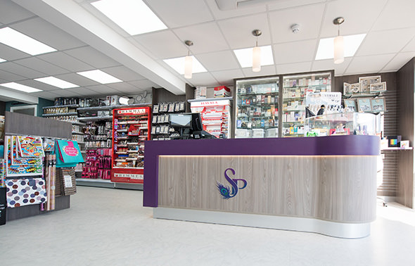
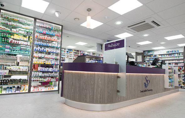
The logo of the pharmacy and the colour scheme has been put together by the Sharda’s daughter, who worked with our branding and design team to create a suite to match the family’s vision. To stop the space from being so clinical and cold the colour choice has been to focus on warm purples, fuschia, blue, grey and white. The finishing touches to the peacock logo gives the pharmacy an individual charm, which is fantastically coupled with the family’s focus on the end patient user and customers that visit the pharmacy.

